Is your website converting the way it should?
It might not be generating the results you were hoping for. Find out which of these 12 steps are causing your low number of conversions.
You’re probably noticing some if not all of these strange visitors’ behaviors:
- Visitors ARE coming to your page, but they are NOT signing up.
- Emails get clicked but no one takes action as described in the emails.
- Visitors somehow fill the signup form or even get to the checkout page but close the window and leave.
If you notice any of these issues with your site, don’t get discouraged. The solutions are not that mysterious. It can definitely be annoying when you’re trying to do your best but still nothing works for your website.
Before you give up on your website or start changing everything in attempt to make it convert more, take a good look in the conversion procedure you are following.
The Conversion Funnel – lead visitors where to go:

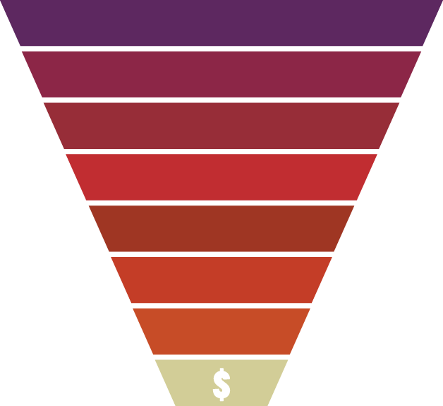
The conversion funnel, if followed correctly, works for any website or landing page. The conversion funnel is a series of steps to follow to ensure your website is setup correctly and maximizes the chances of conversions.
Each step in the funnel connects the visitor to the next step or action. If any of the steps are not setup properly, it will affect they whole conversion funnel. Your goal should be to discover that one problematic component in the chain to find out what’s causing the low number of conversions.
Take a look at the 12 steps below to learn about the right conversion process. Compare it to your website to learn which component is working and which one is out of whack.
- Ads Create compelling graphics that the user wants to click.
- Landing Page Headline Capture the visitors attention with a strong ad relatable title.
- Landing Page Copy Engage users and show them of benefits of what you’re selling.
- Newsletter Signup Form Make it short and easy to fill out.
- Newsletter Signup CTA A big beautiful compelling button.
- Email Subject Line It should be interesting and short.
- Email Content Content should complement the page they signed up to.
- Email CTA Another big beautiful button.
- Product Page Headline Capture the prospects’ attention.
- Product Page Copy Tell them how they can benefit from your amazing product.
- Product Page CTA Another big beautiful button.
- Checkout Simplify the checkout and add some trust factors so the user feels secure.
YAY, you just made a sale!
Each component must work flawlessly in the funnel.
If you have a high bounce rate on your page, this means something in the funnel is not performing the way it should be. Maybe you’re not showing your product in the correct area of your page, or it might not be properly described. If that’s the case some major tweaking is required.
For example: Let’s say, you put some ads on your site to show the visitors how to make money. First you succeed by having the user actually click on the ad to know more about your secret, great. But then they land on a page with a title “How to optimize you’re website”. Is the relation clear to the customer?
Put yourself in your visitors shoes. I bet you’d be pretty confused, feel duped, or even scammed and abandon the site immediately. The gap between the ad and the landing page needs to be bridged by either an adjustment in wording or the offer provided.
Your page at each step needs to motivate visitors to perform the next action.
The best way to evaluate your conversion rate is to check the bounce rate of your websites pages. If the bounce rate is high, it could be the indication that the heading or graphics not be compelling enough to make a visitor stay on your page. Visitors are coming, but they leave as soon as they read the heading or see the top visible part of the page.
On the other side, if your visitors are reading the content but are not completing the CTA, to perform the sign up or purchasing your product you might have to rethink how you’re presenting your product or offer.
It’s so important to make it clear to your visitors what you’re actually selling and what you want them to do on your page. If you need them to subscribe, put a nice signup form that should be visible and easy to fill out. If you’re selling something, describe your product and make it clear what your product does and why they should purchase it.
So how do you fix the gaps in the conversion funnel?
You have to give some detailed attention on your conversion funnel to see what part might be causing the low number of signups or purchases on your site. You have to go through the whole process by yourself to understand how the all steps are connected.
Do some variations in each step one by one and evaluate the results. In the future, if your conversion rates are not up-to your expectations refer back to these steps to figure out which is the weakest link in the chain.
Want Us To Boost Your Conversions Bigtime?
Get Your Free & Discreet Consultation With Control Square Now!
We’ll reach out to you shortly.


